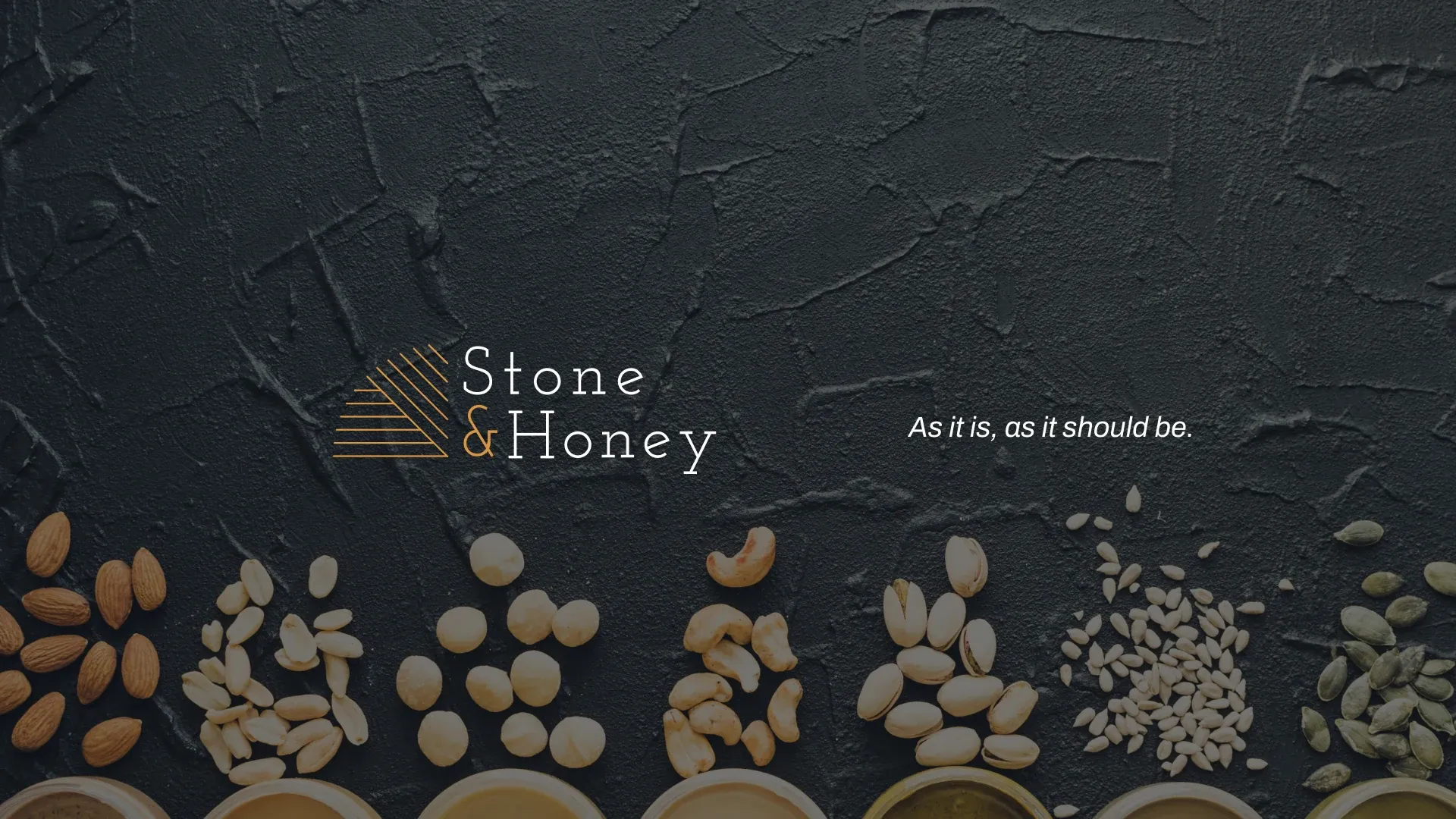
Stone & Honey brand presentation hero image

The branding challenge behind a nut butter brand.

The brief was simple: let the ingredients speak for themselves. No added sugar or oil — just the natural flavor of the nuts. Through transparent sourcing and seasonal blends, the goal was a brand trusted by people who care about what's inside the jar.

Tools Used
PsAiDn
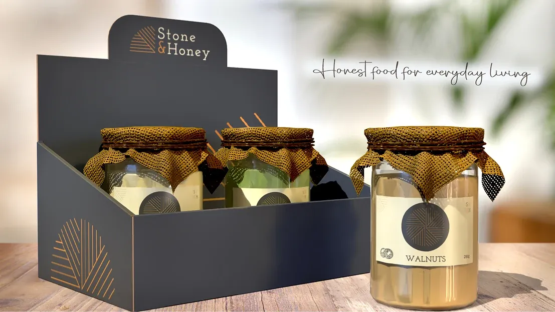
Stone & Honey jar packaging displayed in a branded countertop box

The target audience is health-conscious men and women aged 25 to 50. Before buying, they check the ingredients, sourcing, and process, valuing purity, honest craftsmanship, and real quality over price.

Customer reading the label on a Stone & Honey jar

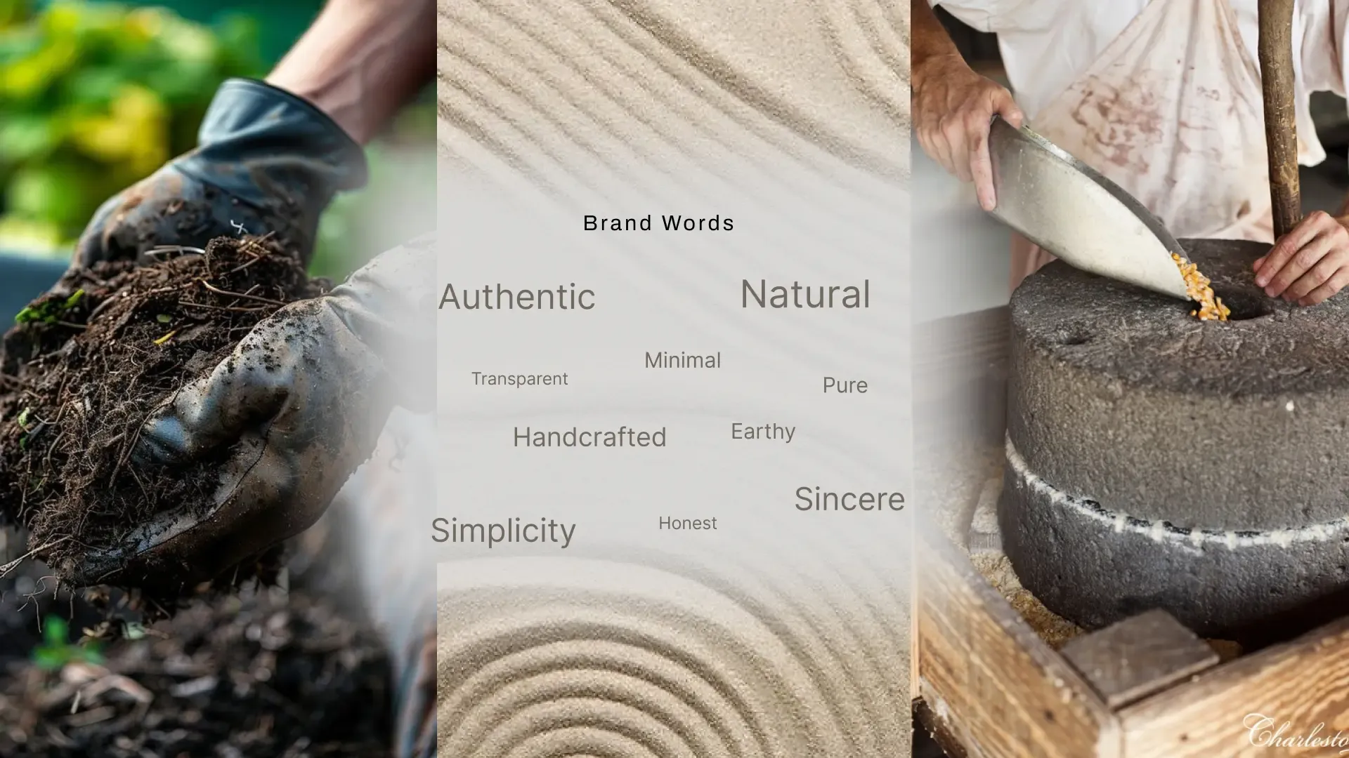
Keywords

Brand word map: authentic, natural, minimal, transparent, pure, handcrafted, earthy, simplicity, honest, sincere

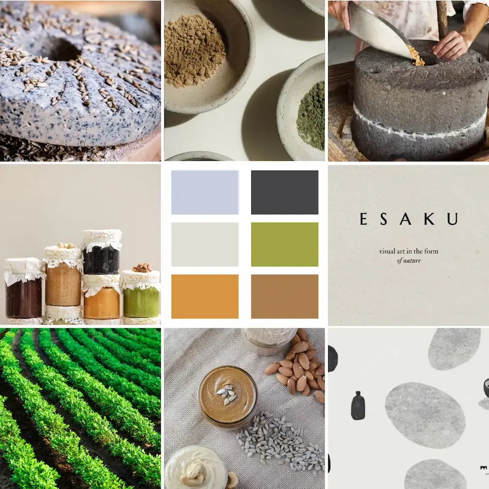
Mood board

Stone & Honey mood board
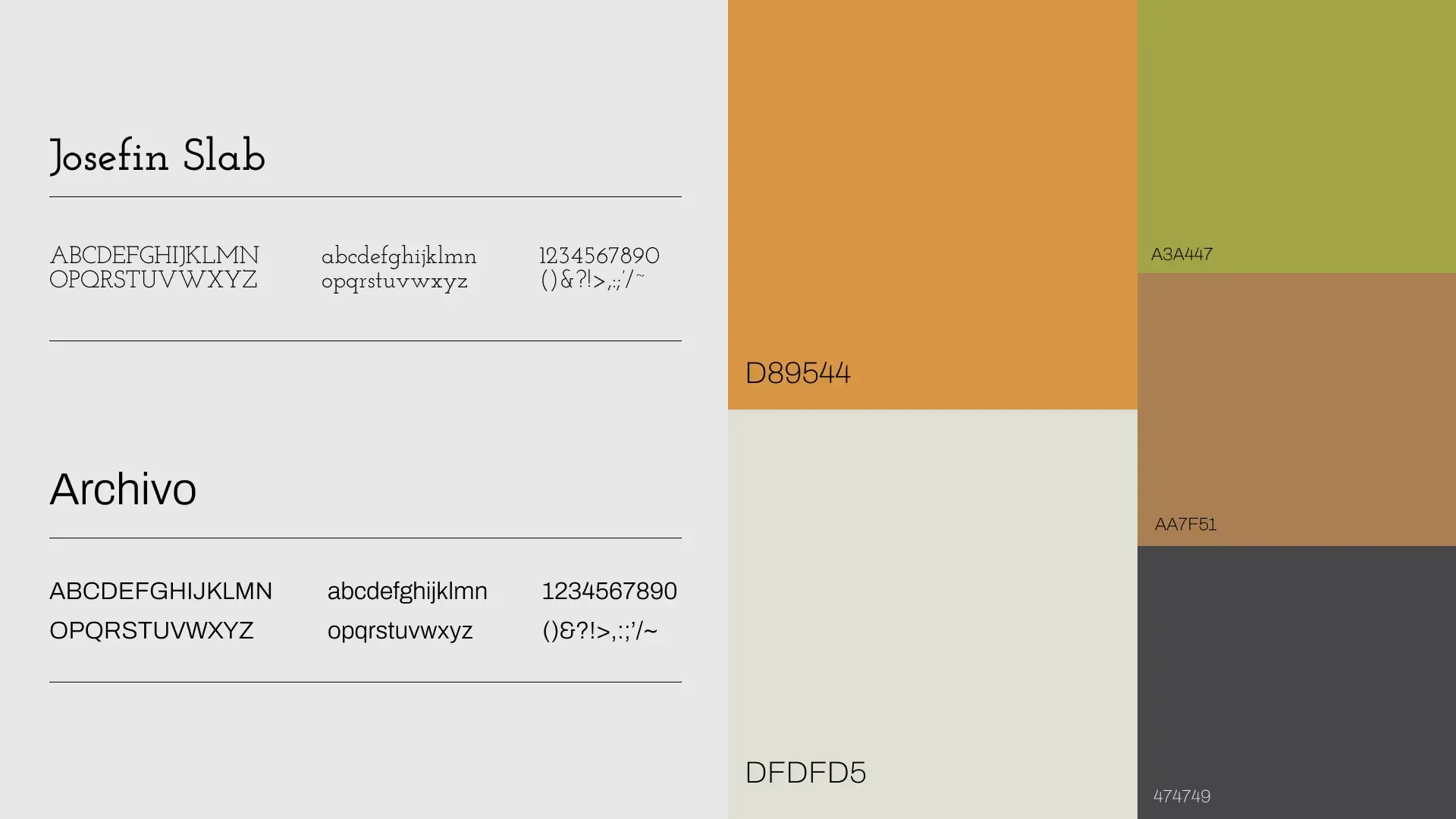
Stone & Honey typography (Josefin Slab, Archivo) and color palette

Logo directions

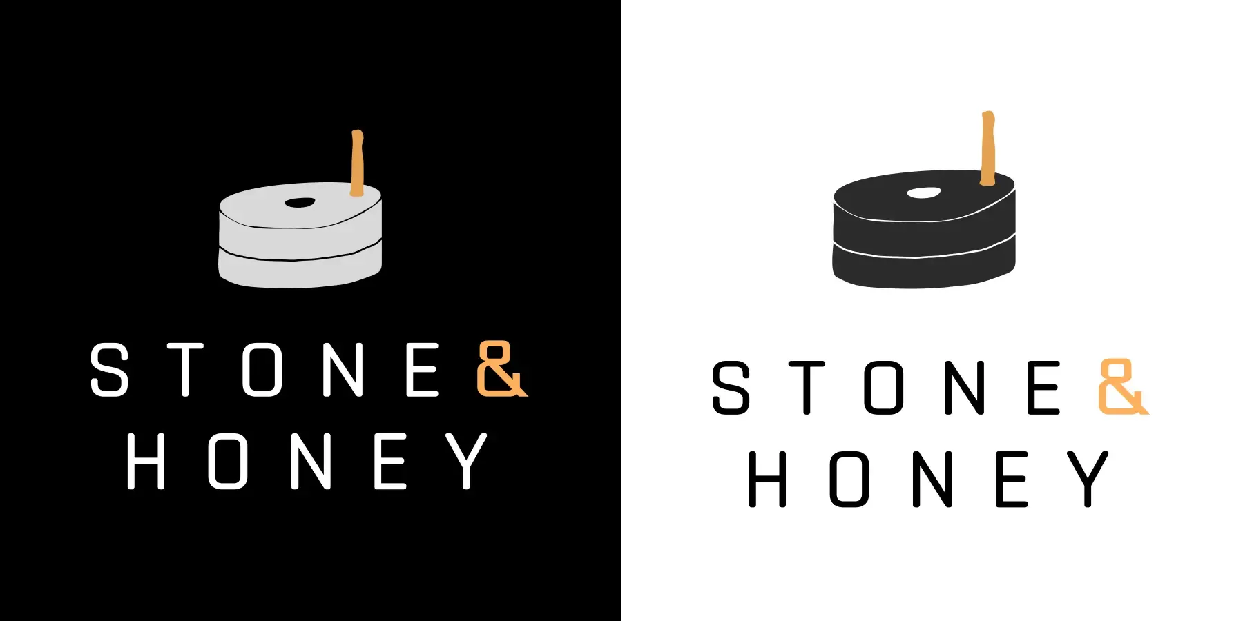
1Logo direction 1: candle icon mark with Stone & Honey wordmark
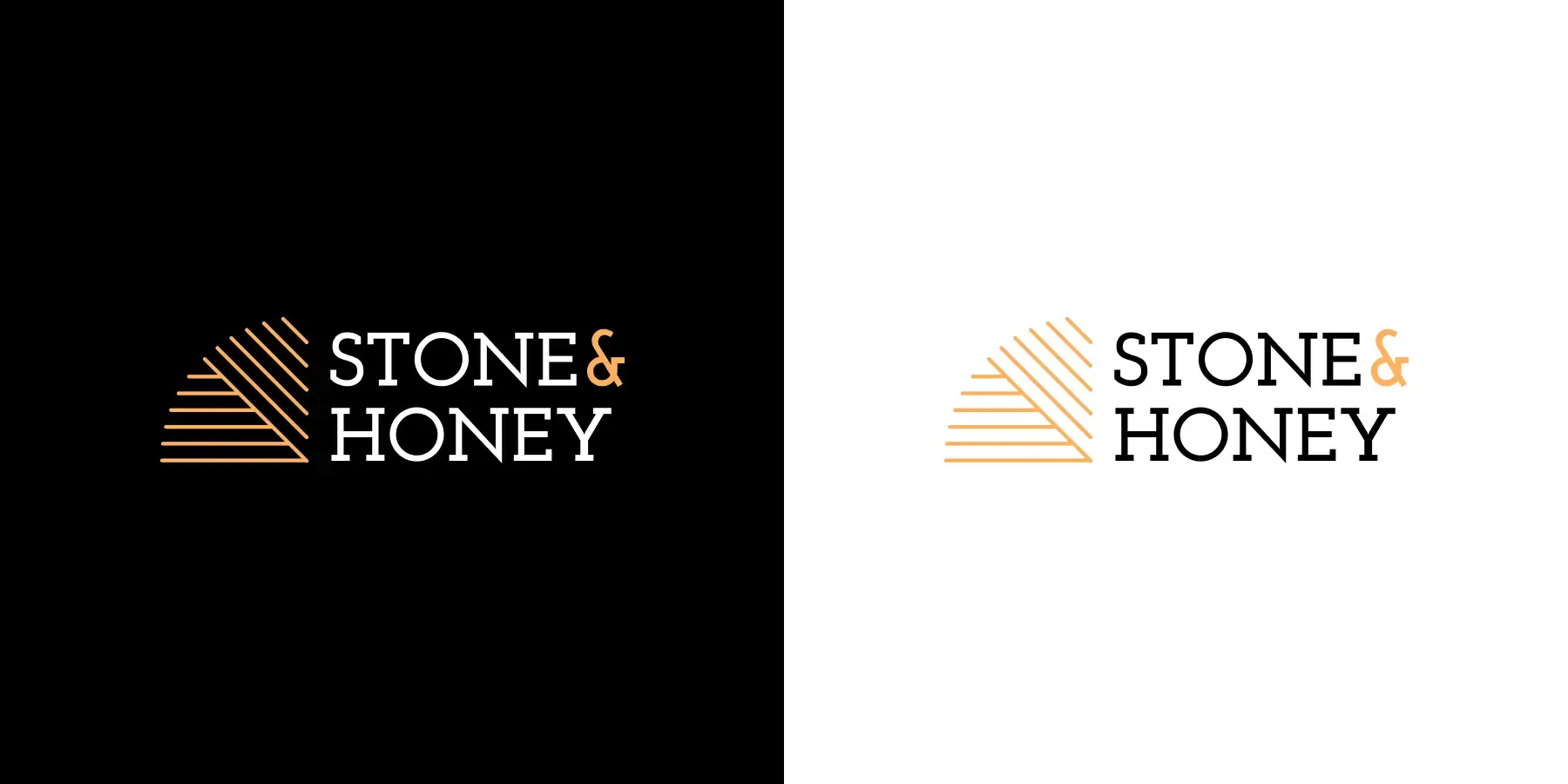
2Logo direction 2: mountain line mark with Stone & Honey wordmark
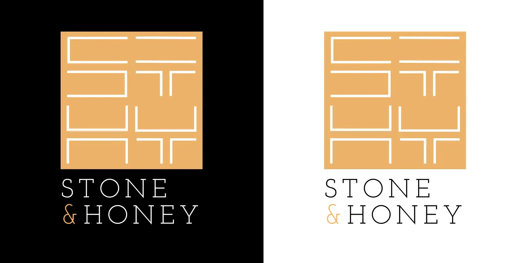
3Logo direction 3: ST monogram grid mark with Stone & Honey wordmark

Final design

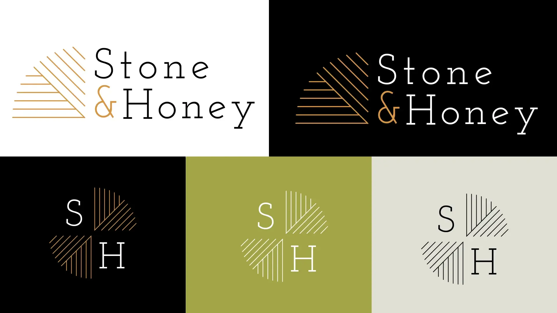
Final Stone & Honey logo system: wordmark and SH monogram across light and dark backgrounds
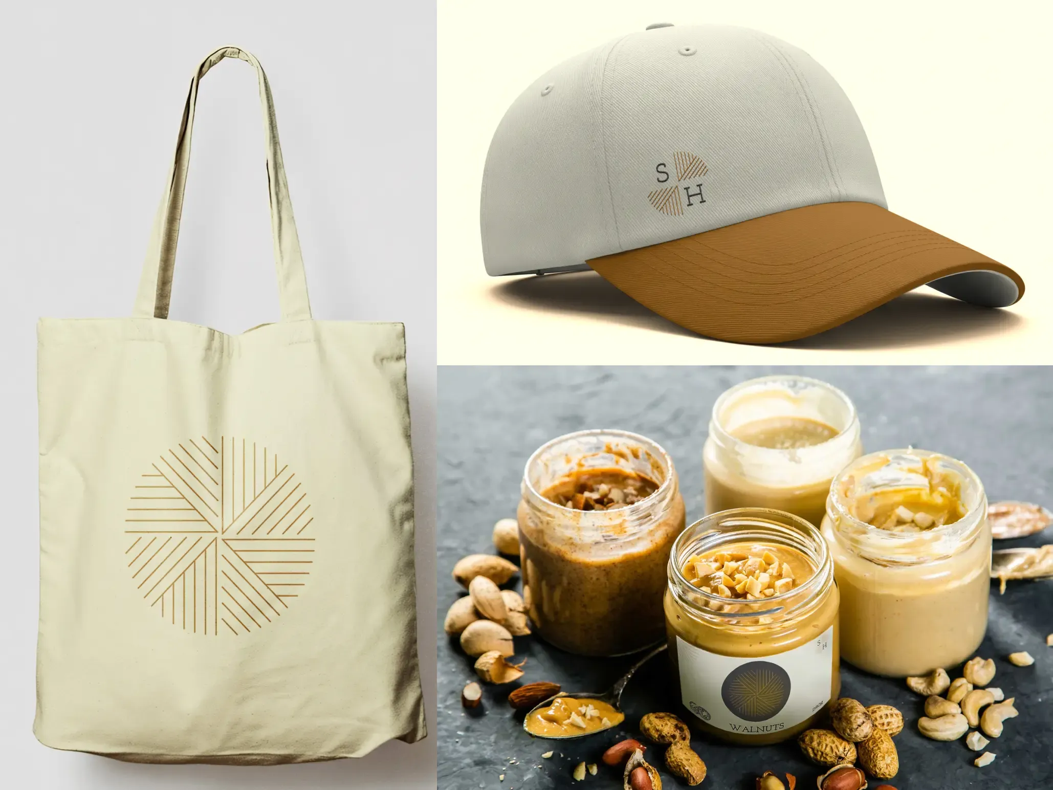
Stone & Honey merchandise mockup: tote bag, cap, and jars
Back to archive

Other Projects

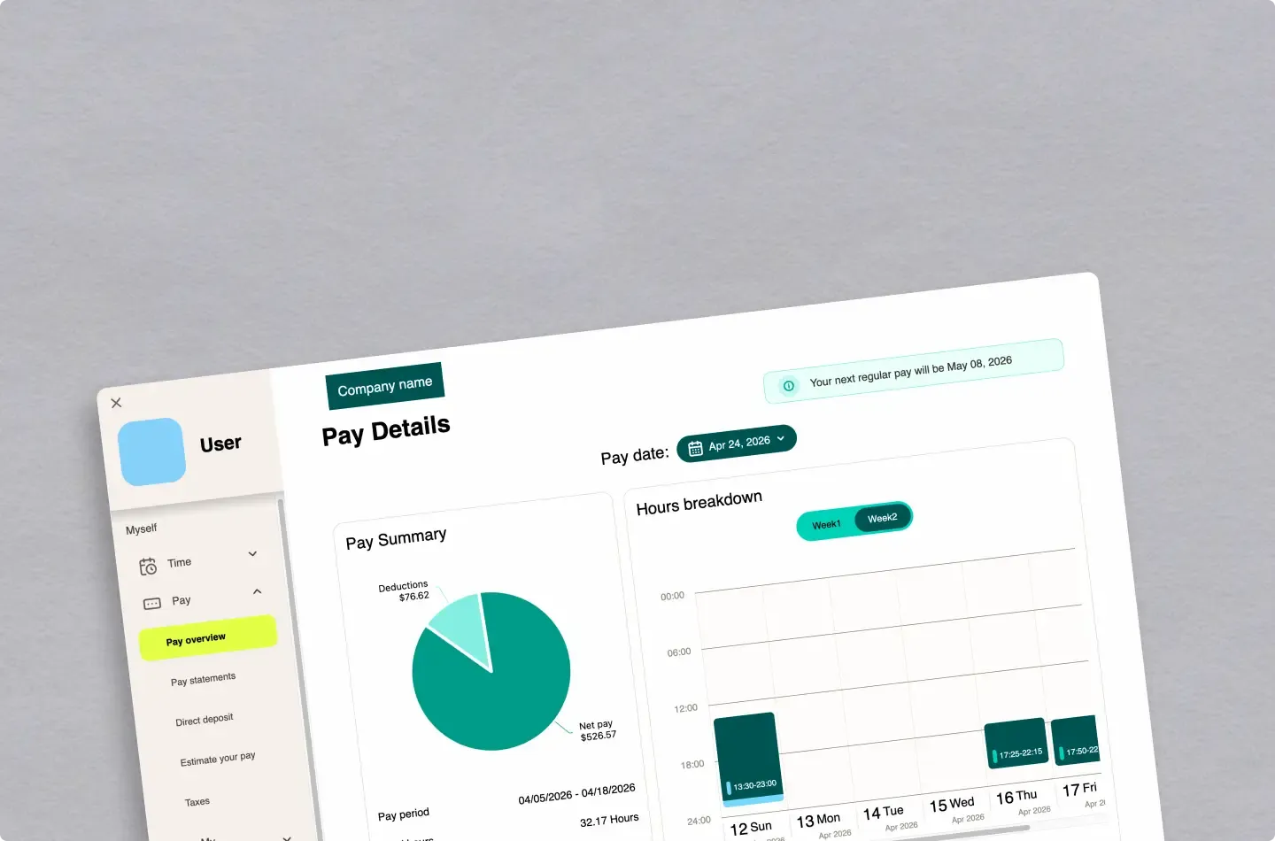
UKG Payroll Verification Redesign
UI/UX case study

UKG Payroll Verification Redesign

Researched and redesigned the payroll verification experience for UKG, based on real user interviews and feedback
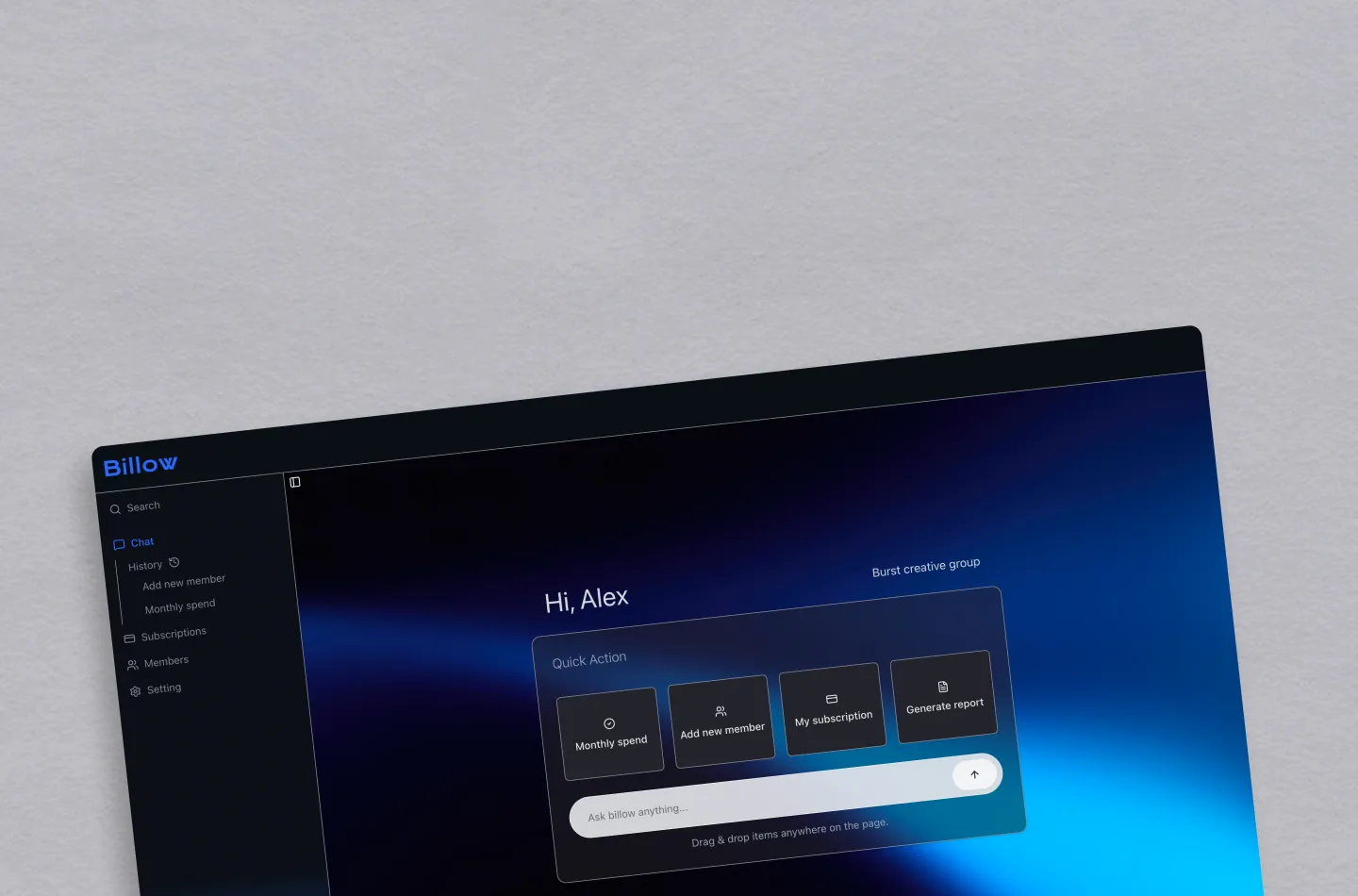
Billow
Web dev

Billow

AI chat–based dashboard built with Next.js, focusing on conversational UI and chat interaction design.