Interview 1
“I can see the total hours worked, but I can’t see the breakdown.”
Grocery Staff

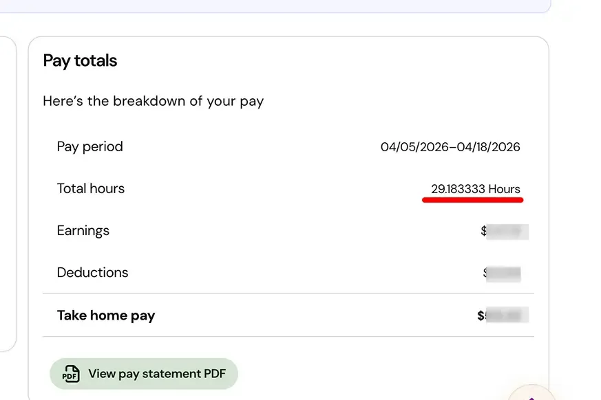
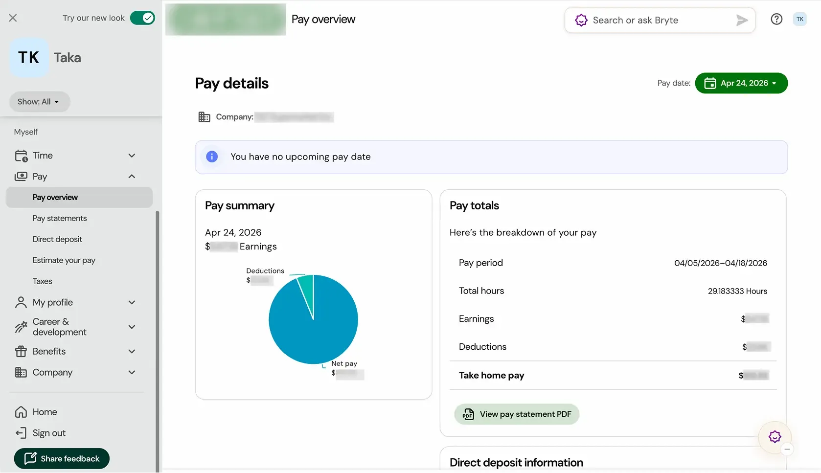
The existing payroll screen showed total hours, but provided no way to verify them.
About this project

An employee platform for managing work hours, accessing payroll information, and reviewing pay statements.
Goal
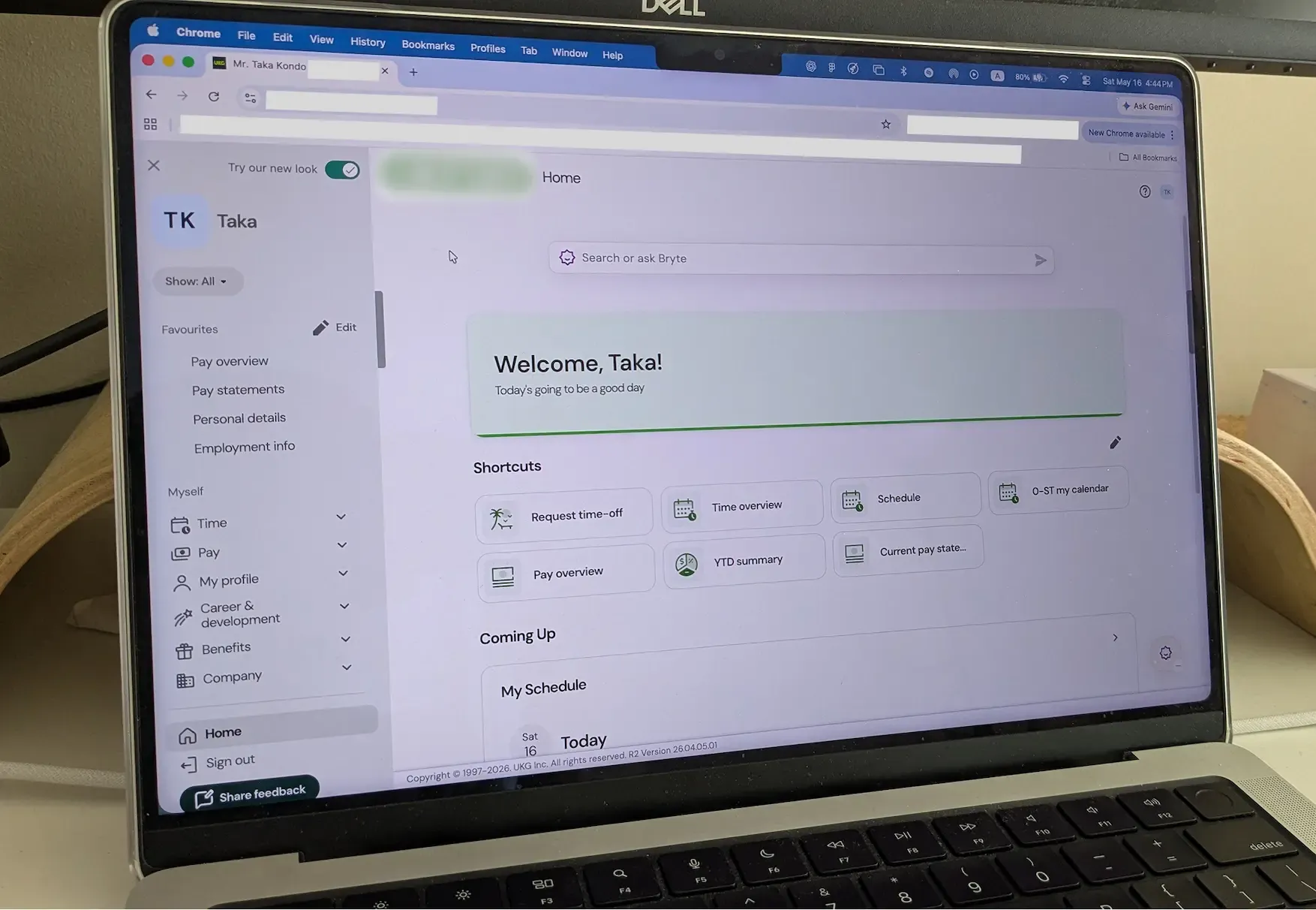
This project began with UX research focused on UKG Pro, which I actively use at my part-time workplace primarily to review pay statements.
The goal of the redesign was to improve transparency and verifiability within the payroll checking experience.
My Approach
In this project, I first analyzed pain points through interviews and surveys conducted with real users, including my coworkers. Based on these insights, I designed the UI in Figma, built a prototype using AI-assisted development tools, and gathered feedback through participant evaluations.





During a regular day at work, a conversation about checking payroll in UKG revealed a shared frustration among my coworkers and myself. To better understand the issue, I conducted interviews with other coworkers.
“I can see the total hours worked, but I can’t see the breakdown.”
Grocery Staff
“The punch records should exist somewhere, but I can’t verify them in UKG Pro. The schedule only shows assigned shifts.”
Cashier

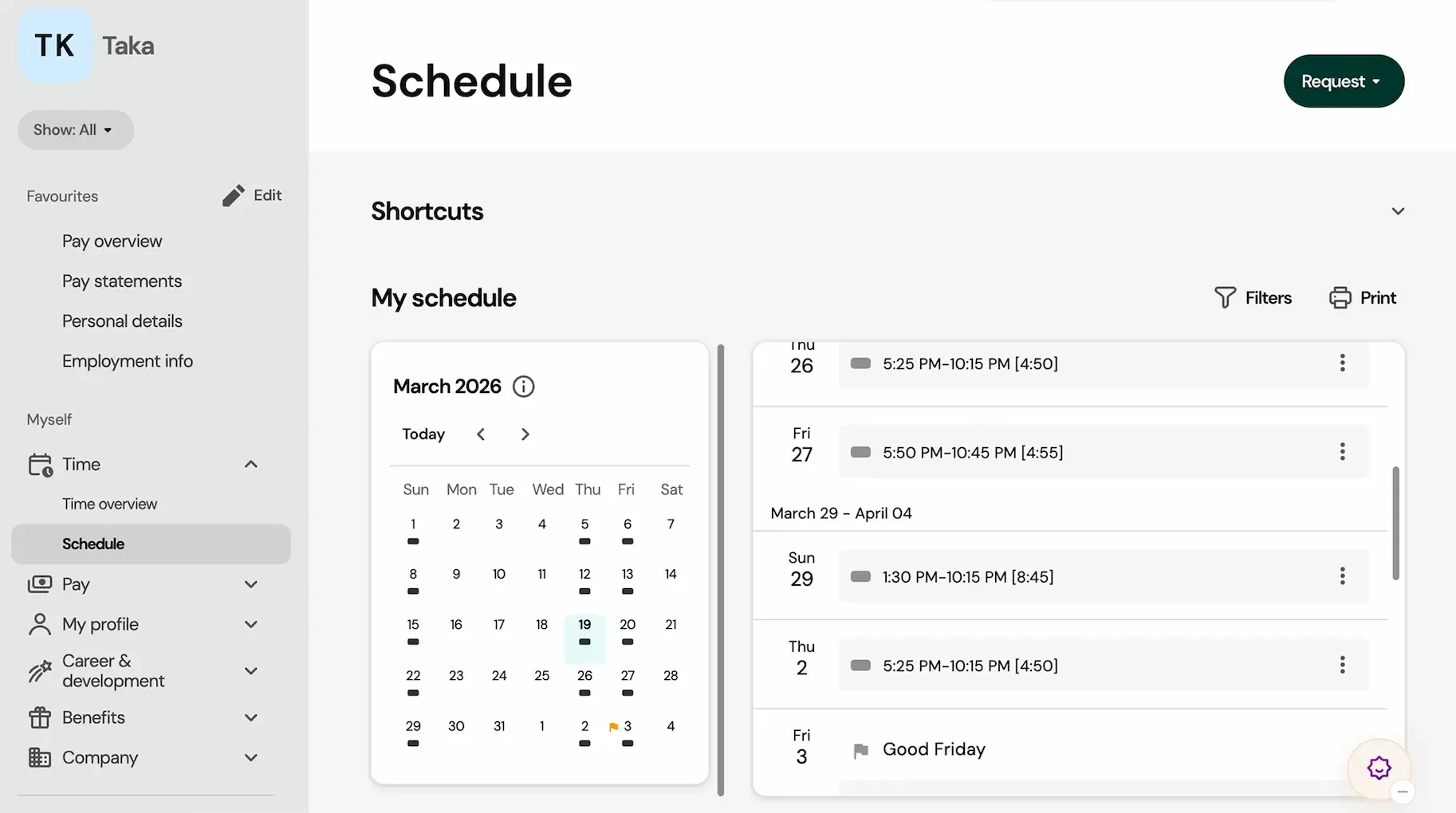
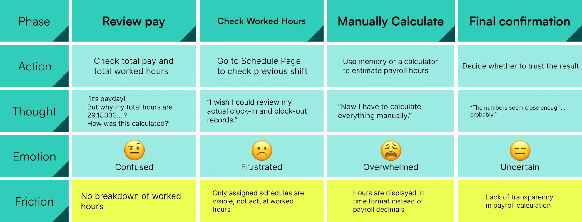
Users cannot verify how payroll hours are calculated, forcing them to rely on manual estimation instead of system transparency.
User Intent
Confirm that payroll hours were calculated accurately
Outcome

The user leaves without knowing the exact payroll calculation

Conducted a survey to further validate existing pain points and identify strong user demand for better visibility into payroll records.
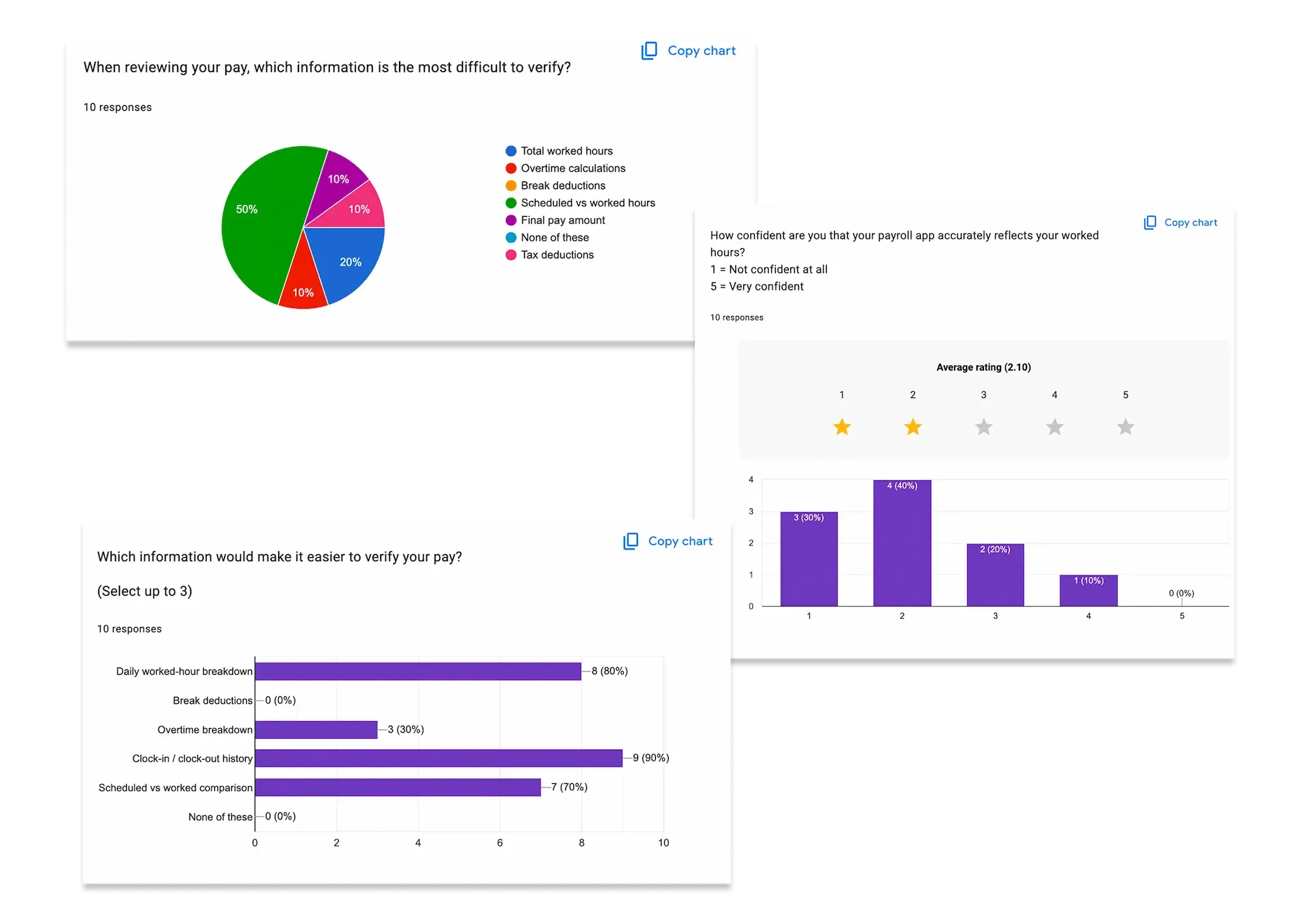
Users lacked confidence in payroll calculations because the system did not provide enough visibility into payroll records and actual worked hours.
DESIGN CHALLENGE
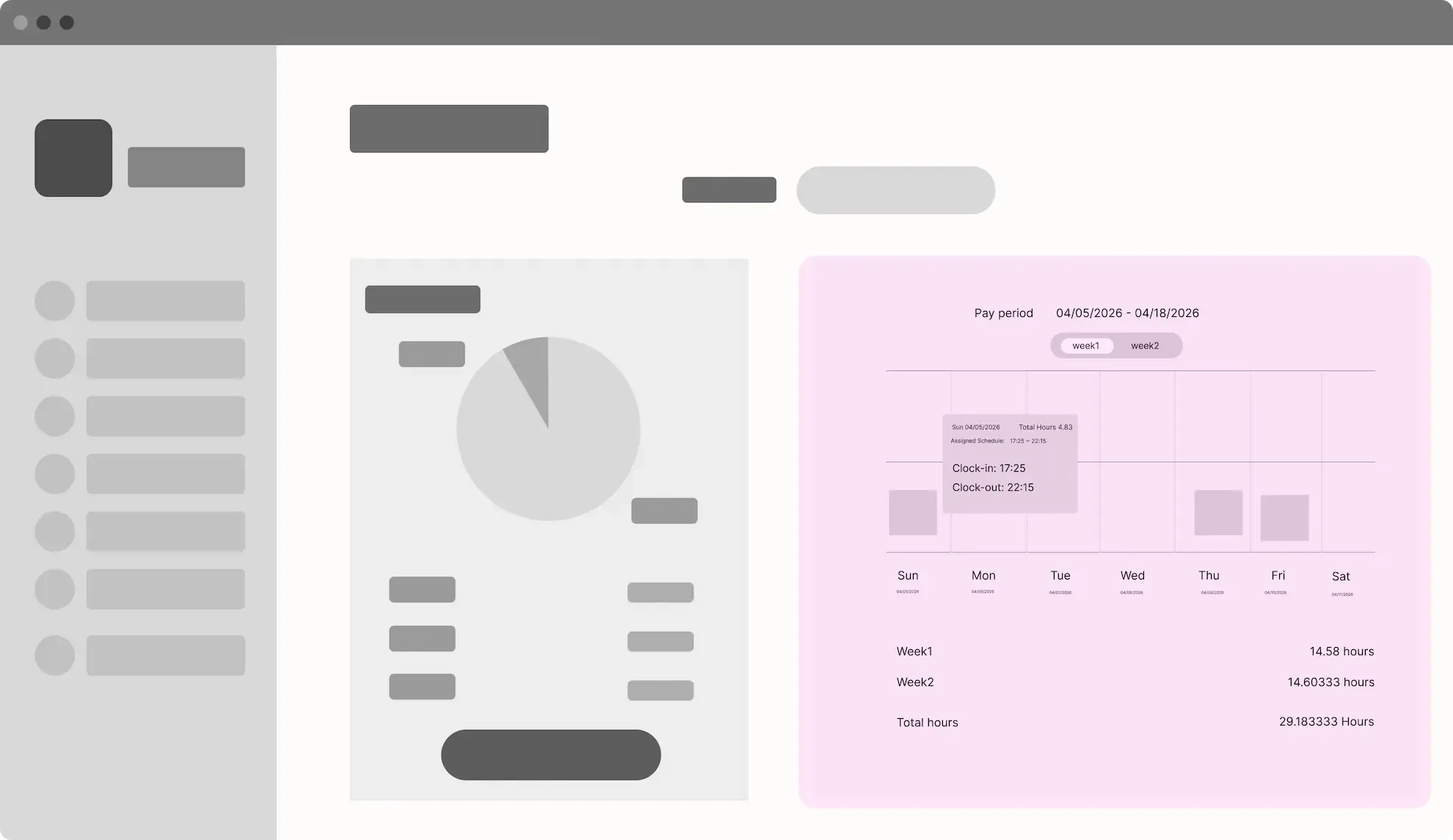
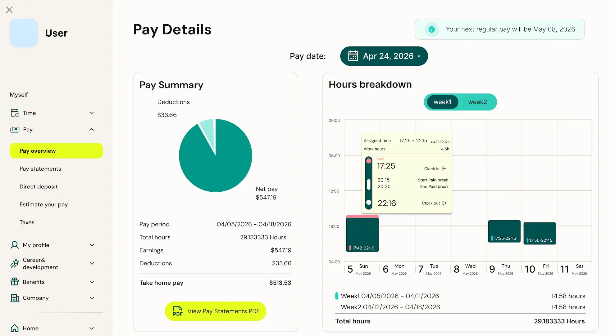
As an employee, I want to review my clock-in and clock-out history so that I can verify how my payroll hours were calculated.

In 2025, UKG introduced a refreshed visual identity.
The redesign explored how the updated visual identity could be applied more consistently across the payroll experience.


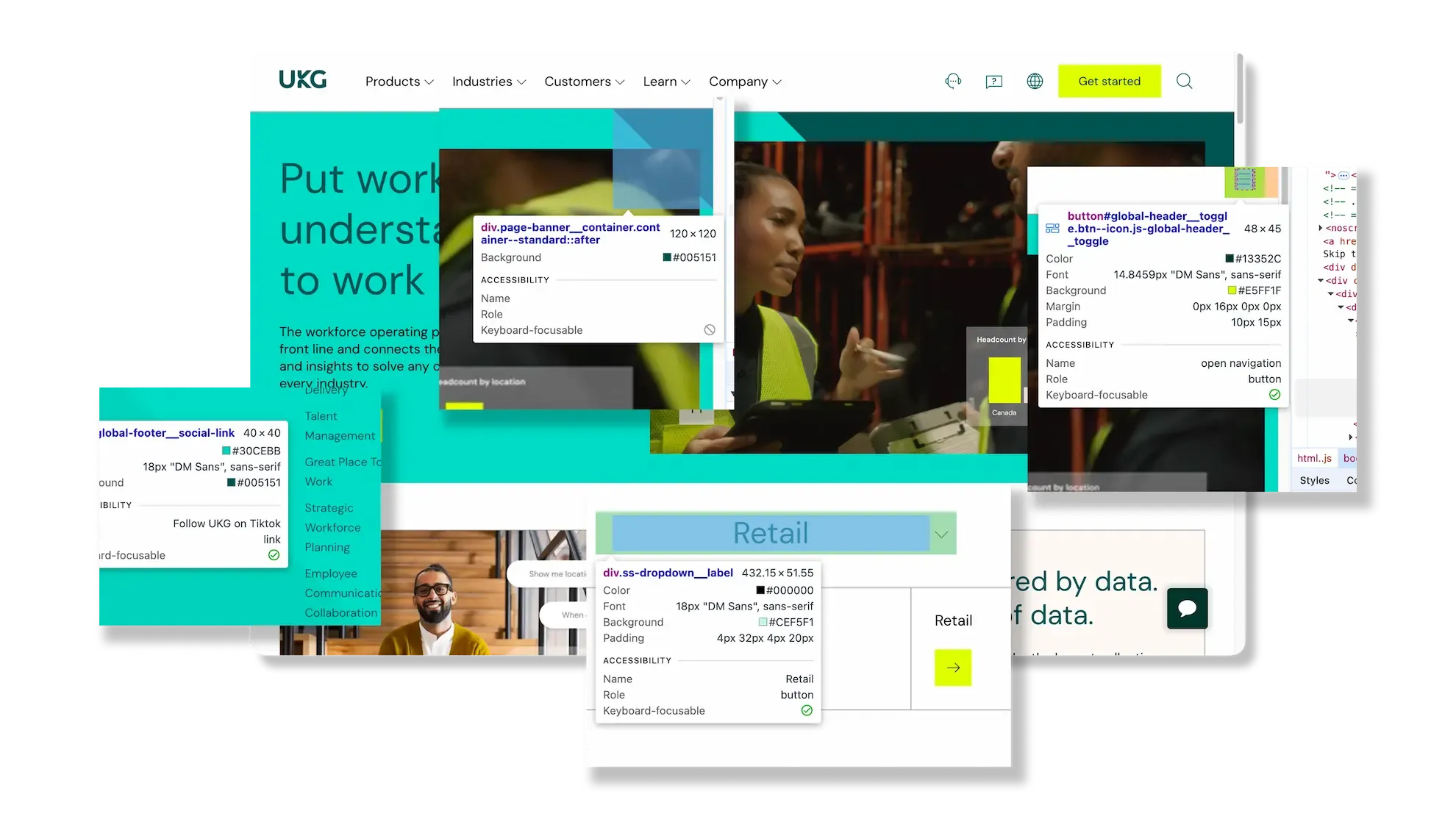
Since the official design system was not publicly available, visual styles and UI patterns were independently analyzed from UKG’s public website.
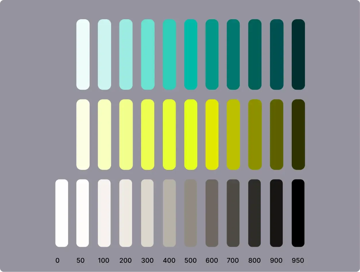
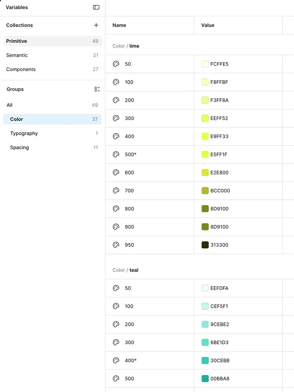
Primitive color tokens derived from the analysis
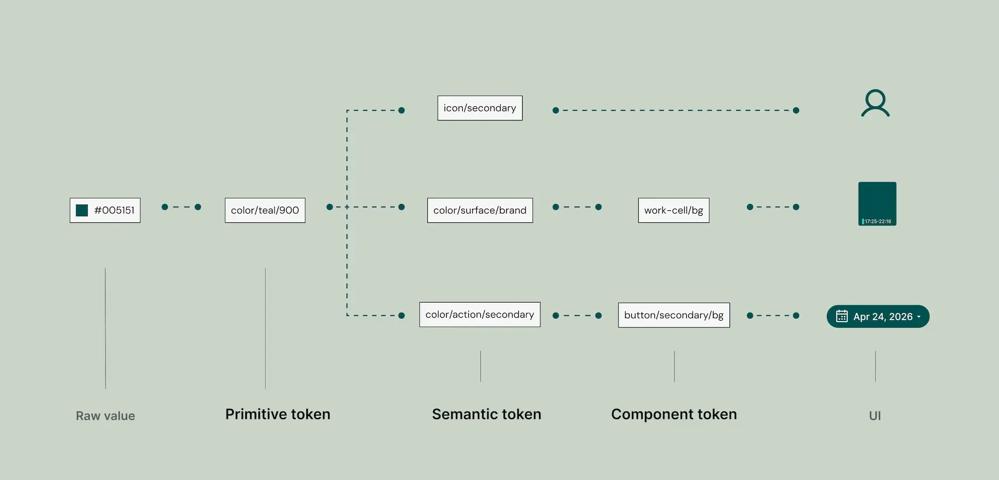
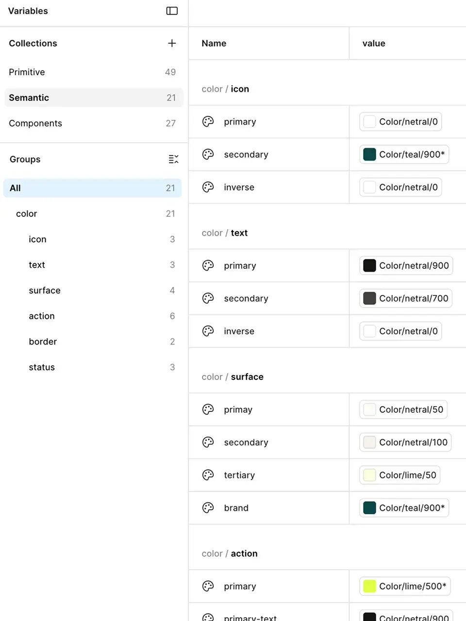
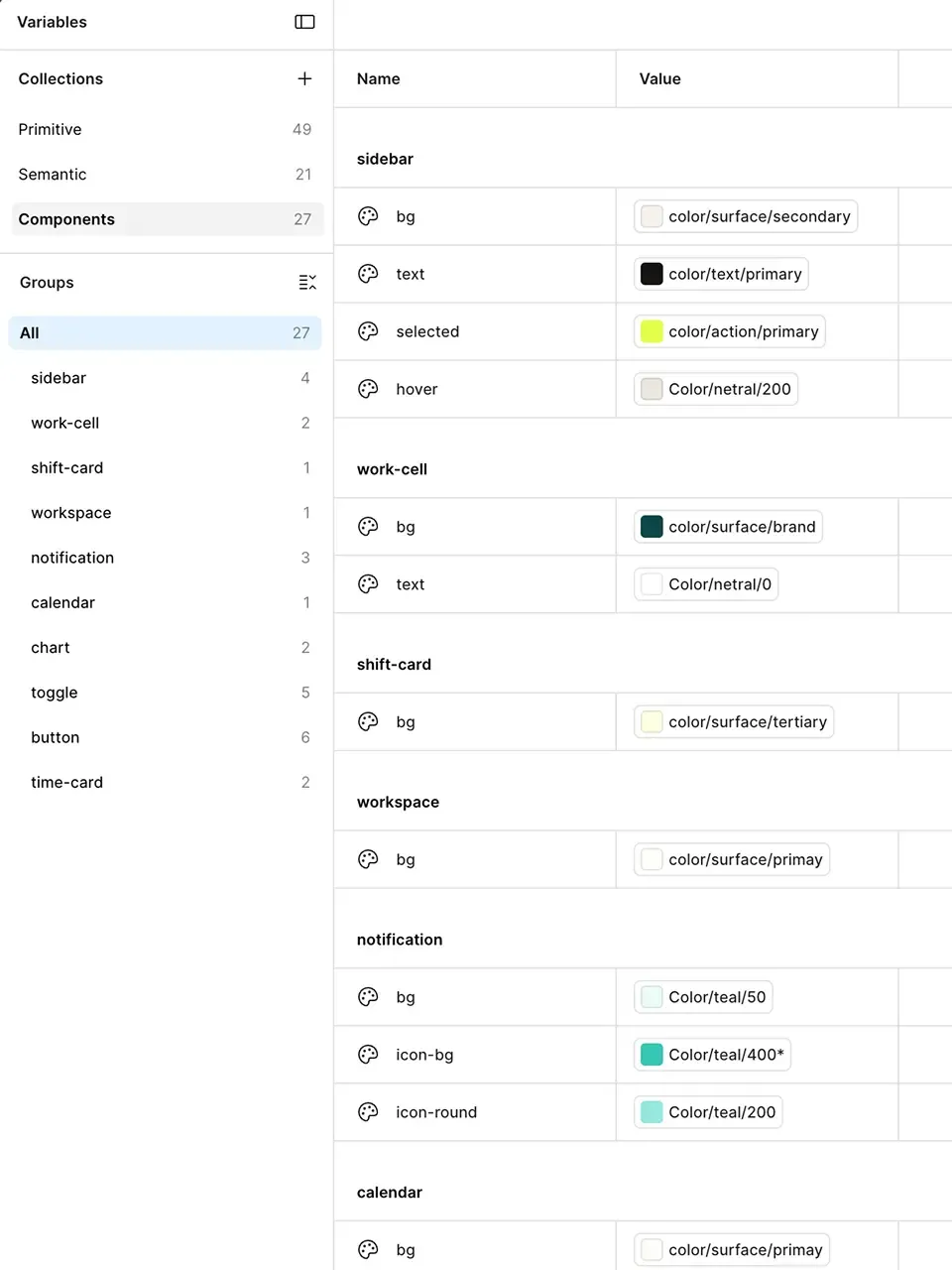
Rather than connecting raw color values directly to the UI, I designed a hierarchical structure consisting of Primitive → Semantic → Component (optional). I placed particular emphasis on Semantic Tokens, as defining intent and meaning instead of visual values helps create more consistent design rules. Since this project contained relatively few repeated UI patterns, Component Tokens were introduced only where they provided additional value.
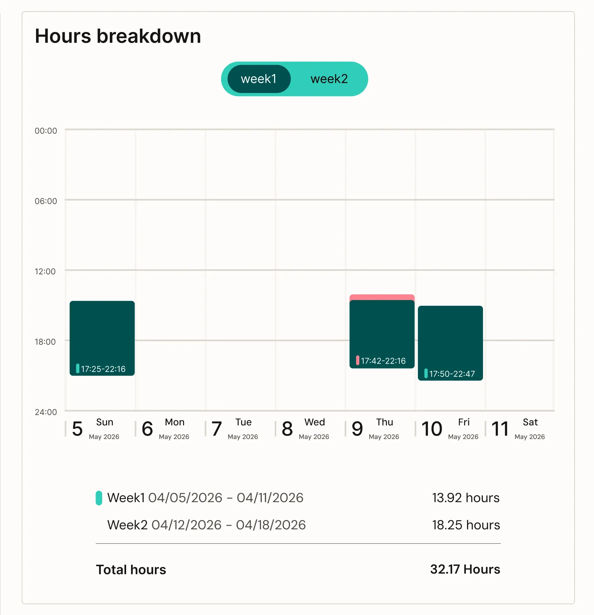
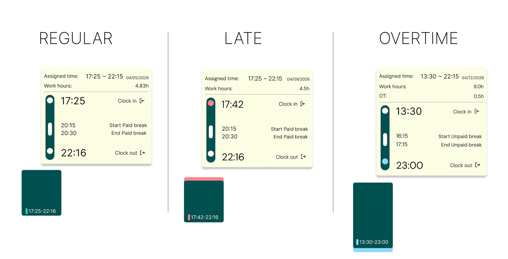

Rather than stopping at static Figma screens, I built a functional prototype in React to test the interaction model in a more realistic environment. Codex helped me move faster by supporting mock data setup and interaction implementation, making it possible to recreate a testable experience in a short timeframe.
I also translated the design tokens defined in Figma into CSS, creating a consistent workflow from design decisions to implementation.
:root {
  /* Primitive */
  --color-teal-500: #00bba8;

  /* Semantic */
  --color-surface-brand: var(--color-teal-900);

  /* Component */
  --work-cell-bg: var(--color-surface-brand);
}

@layer components {
  .work-cell {
    background: var(--work-cell-bg);
    color: var(--work-cell-text);
  }
}
Verification
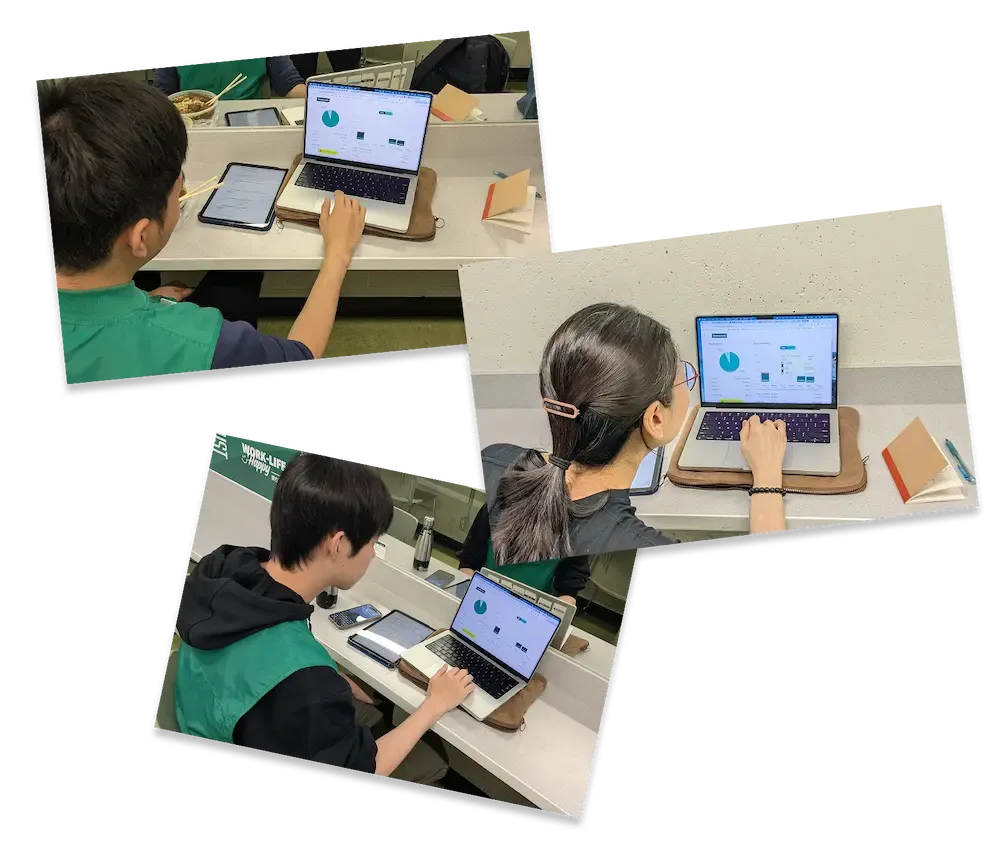
To evaluate whether the redesign improved transparency during payroll verification, a comparative usability test was conducted comparing the existing UKG interface with the redesigned experience.
Participants completed the same tasks based on a shared work scenario, while measuring their understanding of payroll information, trust, and confidence in verifying payroll accuracy.
Findings
Participants using the redesigned version were able to verify payroll information with greater confidence compared to the existing interface.
Trust scores improved from 3.8 to 6.8 after introducing supporting information such as worked hour breakdowns and clock-in/out records. These findings suggest that improving transparency increased trust in payroll information.
Through this project, I learned that user-centered design is not easy. Users are not all the same. At my workplace, people of different ages and backgrounds use the system, so my assumptions were not always correct. For example, the work hour cell UI was not as clear for everyone as I expected. At the same time, finding these problems showed me the value of talking to real users. This project taught me that UX design is not only about creating screens, but also about listening to users and testing ideas repeatedly.